Designism
 I haven't really been to a design forum since college. I guess there was the One Awards and a Graphic Havoc book release in NY, but not an actual lecture. So, when I found out that the Art Directors Club was hosting Designism: Panel Debates Role and Responsibility of Creatives to Instigate Social Change, I knew that I had to go.
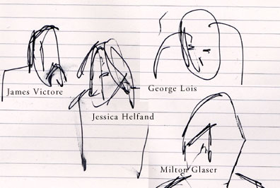
The panelist included George Lois, Jessica Helfand, James Victore and Milton Glaser.
I wasn't even too sure what M. Glaser looked like. Maybe, I have seen a photo of him a while ago but if you asked me to describe him yesterday afternoon, I wouldn't have gotten past "old man". While I was talking to my friend and coworker, Jason, and waiting for the debate to begin, this man walked by. We both turned to each other with questioning grins. It was totally M. Glaser. He seemed to radiate original poster design energy. Anyway, everyone took their seats, the panelist were introduced and it was, in fact, him.
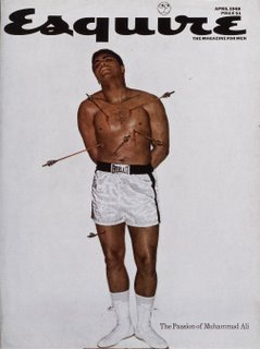
Now, the tone was set by, writer, Tony Hendra's brief summary of his new book. A politically charged what-if-Jesus-came-back -as-a-poor-kid-from-brooklyn scenario, The Messiah of Morris Avenue, is chalked full of punny jargon such as: Slow Child Left Behind, Faith the Press and a Bloodless Civil War. ...you get the gist. *sigh, grin* The unquestionable marriage of designism and liberalism is so indulgent. George Lois is next. He starts "I was raised in a racist, Irish-Catholic neighborhood of Brooklyn..." He has done a great deal of socially and politically charge work for CBS(McCarthy/ Red Scare), Sane, Bobby Kennedy and Esquire. This particular cover illustrated Ali's persecution for coming out against the war.
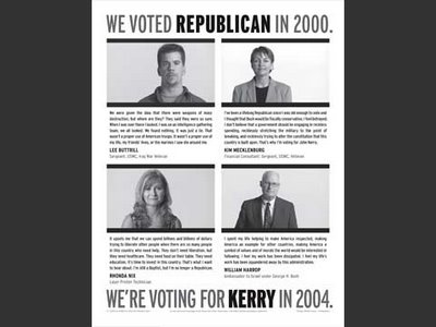
 Jessica Helfand, who I didn't know much about before hand, was far more focused on gathering information and collection than typical design. She is currently working on a project that will collect information and photographs from polling locations and organize it for use on line.
This is a campaign she did for MoveOn.org
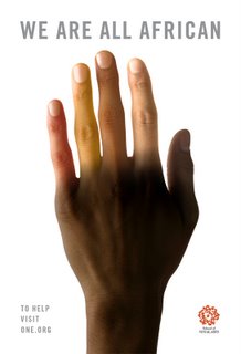
James Victore, who I have previously posted, explained that his constant questioning of authority stemmed from a childhood spent on military bases. J. Victore does expressive pieces that are completely uninhibited by technology. He was also unihibited in speech. Closing line: "... with this asshole mother fucker for president..." While I feel like he wasn't as verbally articulate, visually he conjures more emotion and thought than the other three. Milton Glaser didn't get too far into his thoughts before he declared that design for be first and foremost, effective. He reasoned that effectiveness didn't include preaching to the choir but engaging everyone; Rage is not effective. -I can't be sure but I thought I saw J. Victore squirm. I can't imagine M. Glaser wouldn’t take a stab at another man's methods. It just so happened that his were totally different than the speaker before him.- You've seen his work everywhere: I (heart) NY, that trippy dylan poster and number of other recognizable posters. Recently he has been working with One.org to promote awareness and encourage involvement in the effort to fight poverty and aids.

1 comment:
It's notable (and eyebrow-raising) that this panel did not include a single real, live activist to temper the abstract opinions of these designers and critics.
As I've commented to Bill Drenntel before (much to his discomfiture), high-end designers and advertising people often completely misunderstand what kinds of designs work at the grassroots level.
Despite paying lipservice to notions of contextuality and "working with" clients, most designers and ad people view pro bono work for causes mostly as an opportunity to be more "artistic" than their work-for-hire.
But often these designs and campaigns are completely out of step with the target community and the needs of the activist groups for whom they are created.
In my own work as both a (successful) activist and a (self-taught) designer, I repeatedly fended off very bad ideas from Madison Avenue and downtown "pros" who insisted their proposed campaigns were the only way to go. This was the one constant -- their utter certainty in the rightness of their ideas.
Sometimes, in a local or regional campaign, the slickest, cleverest, boldest, or most "dramatic" message is the one most guaranteed to alienate the target audience.
But since the designs which win awards (or get featured in books) are handed out by others in the same peer group as the creatives, not by activists, inappropriate campaigns keep getting rewarded, while effective and contextually smart work is ignored.
I'm reminded of a quote I recently ran across from David Hockney in a Metropolis book:
"I do make a distinction which I think we have lost. The difference is that art must move you, design need not."
When turning their hand to activist work, designers and other creatives too often think that the goal is to "move" the audience. More often, in activist work, the hard part is convincing the audience -- and not alienating them with hifalutin imagery or typography.
Post a Comment